Не попадитесь на накрученные каналы! Узнайте, не накручивает ли канал просмотры или
подписчиков
Проверить канал на накрутку


Телеграм канал «бумеры смотрят телек»

бумеры смотрят телек
17.8K
0
7.1K
4.7K
2.4M
Бренды, маркетинг и занимательные диджитал-истории.
Сотрудничество: @alexdali
РКН: https://rkn.link/muQ
Сотрудничество: @alexdali
РКН: https://rkn.link/muQ
Подписчики
Всего
157 767
Сегодня
-18
Просмотров на пост
Всего
9 725
ER
Общий
6.16%
Суточный
5.09%
Динамика публикаций

Telemetr - сервис глубокой аналитики
телеграм-каналов
телеграм-каналов

Получите подробную информацию о каждом канале
Отберите самые эффективные каналы для
рекламных размещений, по приросту подписчиков,
ER, количеству просмотров на пост и другим метрикам
рекламных размещений, по приросту подписчиков,
ER, количеству просмотров на пост и другим метрикам

Анализируйте рекламные посты
и креативы
и креативы
Узнайте какие посты лучше сработали,
а какие хуже, даже если их давно удалили
а какие хуже, даже если их давно удалили

Оценивайте эффективность тематики и контента
Узнайте, какую тематику лучше не рекламировать
на канале, а какая зайдет на ура
на канале, а какая зайдет на ура
Показано 7 из 17 800 постов
Смотреть все посты
Пост от 25.10.2026 23:29
1 231
0
43
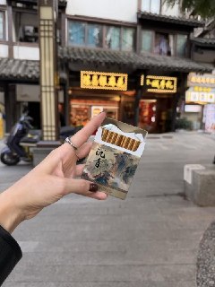
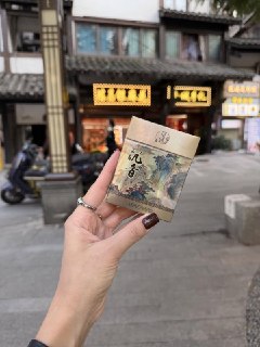
Фан-факт: в Китае продаются безникотиновые сигареты, дизайн которых уделывает любую табачку с никотином.
Судя по количеству реакций в соцсетях, покупают их даже те, кто не курил ни разу в жизни.
Судя по количеству реакций в соцсетях, покупают их даже те, кто не курил ни разу в жизни.
❤
34
✍
2
Пост от 25.10.2026 20:57
2 500
0
51
ИИ-певица завершила музыкальную карьеру из-за… беременности. Аудитория группы BABYQUEEN оказалась в шоке, когда узнала, что одна из виртуальных (!) участниц якобы готовится к рождению ребёнка.
После нескольких дней штурма соцсетей авторы проекта BABYQUEEN признались, что им тяжело продвигать всех своих ИИ-аватаров, поэтому мув с беременностью они рассматривали как изящный выход, чтобы попрощаться с одной из виртуальных певиц.
Вот до чего доводит прожигание токенов 🫤
После нескольких дней штурма соцсетей авторы проекта BABYQUEEN признались, что им тяжело продвигать всех своих ИИ-аватаров, поэтому мув с беременностью они рассматривали как изящный выход, чтобы попрощаться с одной из виртуальных певиц.
Вот до чего доводит прожигание токенов 🫤


💔
5
Пост от 25.10.2026 12:06
1 254
0
48
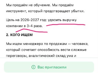
KPI под конец года в каждой конторе страны 👻
Пост от 25.10.2026 11:36
616
0
4
Сегодня День автомобилиста — праздник всех, кто знает цену свободному парковочному месту и по одному звуку понимает, что «там опять что-то стучит».
Чтобы автомобильные дела отнимали меньше времени, в СберБанк Онлайн есть раздел «Авто». За привычные расходы здесь можно получить до 15% кешбэка бонусами Спасибо. Если пора пересаживаться на новую машину, оформить автокредит можно онлайн, в офисе или у дилеров по всей стране.
Пусть дорога будет свободной, а неожиданные расходы встречаются как можно реже 😎
Чтобы автомобильные дела отнимали меньше времени, в СберБанк Онлайн есть раздел «Авто». За привычные расходы здесь можно получить до 15% кешбэка бонусами Спасибо. Если пора пересаживаться на новую машину, оформить автокредит можно онлайн, в офисе или у дилеров по всей стране.
Пусть дорога будет свободной, а неожиданные расходы встречаются как можно реже 😎

❤
3
Пост от 25.10.2026 10:09
863
0
52
Оркестр Самарской области состоит из фанатов серии GTA. Если не верите, послушайте их свежую аранжировку 🥸

❤
19
Пост от 25.10.2026 01:42
562
0
35
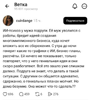
От оплаты чатгпт до психушки один шаг 😬
❤
2
✍
1
Пост от 24.10.2026 22:29
2 988
0
151
«Один дома» возвращается! Маленький Калкин вновь покажется в кинотеатрах России 30 и 31 декабря. Билеты стоят копейки, но их быстро разбирают.
Легальный способ избежать предновогодней нарезки салатиков 🍿
Легальный способ избежать предновогодней нарезки салатиков 🍿

❤
30